
Tim Berners-Lee invented HTML in 1991. In 1993, he wrote the first version of HTML. There was no CSS back then. CSS (Cascading Style Sheets) was first proposed by Håkon Wium Lie on October 10, 1994, while working with Tim Berners-Lee at CERN. In 1996, the first version of CSS was invented. That time, the CSS size was in bytes.
Fast forward to today, where the size of CSS files has grown substantially, leading to concerns about website performance.
Minimum CSS to Make a Website Look Great Everywhere
Our CEO, Morshd Alam, has accomplished something remarkable – crafting his personal website with just 109 bytes of CSS. Here is the unminified version:
html{
  max-width: 70ch;
  padding: 1em;
  margin: auto;
  line-height: 1.75;
  font-size: 1.25em;
}
img{
  max-width: 100%;
  height: auto;
}
Before delving into the intricacies of each CSS element, take a moment to witness the outcome at MorshedAlam.com. It scores 100 on Google’s PageSpeed Insights.
The Magic Behind the Code
1. Maximize Readability
The max-width: 70ch; rule is a game-changer when it comes to optimizing readability. By employing the “ch” unit, an ideal character width range is established, typically falling between 60 to 80 characters. This range ensures that readers can comfortably absorb your text.
2. Seamless Mobile Experience
Ensuring a seamless browsing experience on mobile devices is essential. The padding: 1em; declaration comes into play when the display width drops below the specified max-width. This clever padding prevents text from stretching edge-to-edge, making it more pleasant to read on smaller screens.
3. Effortless Centering
The margin: auto; rule acts as a magic wand, elegantly centering your web page content. By applying it to the html tag, the entire content becomes centered. This approach is versatile and suitable for a wide range of websites.
4. Enhancing Clarity
Achieving clarity is pivotal in effective design. The line-height: 1.75; directive adds balanced spacing between lines, enhancing readability and visual appeal. It’s worth noting that we’ve left the line height unitless for a specific reason: it ensures consistency across various devices and display settings.
The font-size: 1.25em; setting reflects a conscious shift towards larger font sizes, in line with contemporary design aesthetics. This choice accommodates diverse user preferences and allows for seamless scaling. When opting for font size units, remember to embrace em or rem over px to empower users with control over their viewing experience.
5. Responsive Image
To make an image responsive, we only need two rules. The max-width: 100%; rule confines the image within the viewport, ensuring compatibility with various screen sizes. The height: auto; rule maintains the aspect ratio.
By maximizing readability, ensuring mobile friendliness, embracing centered design, and enhancing clarity, you’re well on your way to creating a stylish and responsive web layout that captivates your audience across various devices. So, go ahead and drop in this CSS snippet to elevate your web design game to the next level.
Why a large CSS file is a problem
Large CSS files make a website more complex for a browser to render. When we write CSS, we don’t tell the browser exactly how to render a page. Instead, we describe the rules for our HTML document one by one and let browsers handle the rendering.
- More bytes for the user to download: A website can only load as fast as a user’s Internet connection allows the data to be transferred. A larger CSS file results in more data for users to download, affecting loading times.
- CSS is render-blocking: Render-blocking resources are files that, when the browser encounters them, it must download, parse, and execute before doing anything else, including rendering. CSS is render-blocking. Everything stops for CSS. When the CSS business is done, the road is clear for others. This reality underscores the importance of optimizing CSS for a streamlined user experience.
But the Internet is faster now; why should we care?
While internet speeds have improved, not all users enjoy fast connections. Ensuring a seamless experience for all is crucial.
Let’s examine the typical loading duration for CSS code. We will base our analysis on the average volume of external CSS code found in Bundesliga websites, which is approximately 639KB. This will help us ascertain the loading time required for this specific CSS data quantity. The outcomes are presented in the subsequent table.
| Connection Type | Time (secs) |
|---|---|
| FIOS (20 Mbps) | 0.26 |
| Cable (5 Mbps) | 1.02 |
| Mobile 3G: Fast (1.6 Mbps) | 3.19 |
| DSL (1.5 Mbps) | 3.41 |
| Mobile 3G: Slow (780 kbps) | 6.66 |
| Mobile Edge (240 kbps) | 21.30 |
| Mobile 2G: Fast (150 kbps) | 34.08 |
| 56K Dial-Up (49 kbps) | 91.29 |
| Mobile 2G: Slow (35 kbps) | 146.06 |
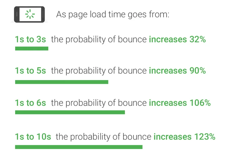
The Internet is faster now, and so is the mind of people. They have no patience now. They bounce soon if the website fails to load quickly.
Google’s studies highlight that the critical period for a user’s decision to bounce is within 3-5 seconds of page load. See below:
How big should your CSS file be?
Crafting the ideal CSS file size isn’t possible; it’s a balance between necessity and efficiency. Your CSS file should be ‘as big as it needs to be, but as small as you can make it’.
Are you sure your CSS files are as optimized as they can be?
CSS gives us the opportunity to play with a page layout, adjust colors and fonts, add effects to images, etc. to make websites unique and attractive. To do so, we’re piling up our CSS file and making our website perform poorly. And there is another problem: unavoidably repeating ourselves. We declare the same rules in our CSS file over and over. As a result, we get large CSS files and poor performance.
There is no ideal size of the CSS file for a website. To my opinion, your CSS file should be less than 10kb; the smaller, the better.
To get the best result, avoid unnecessary repetitions while writing CSS code and embrace minification and compression techniques.
In Conclusion
Crafting a visually appealing and responsive website doesn’t necessitate bulky CSS files. By leveraging minimal CSS, you can create a stunning user experience that loads swiftly across devices. Embrace the power of streamlined design and optimize your website for success.
")


